
By popular demand, I’m so excited to bring to you this not-so-mini art tutorial on how to adapt book covers into horizontal headers!
You probably know that all of my reviews are posted with full background headers, the graphic entirely relevant to the book cover. And today I’m going to show you how to do this—to the best of my ability, at least.
It requires some craftiness and maybe a little bit of an eye for composition, but it’s not usually that hard. (It can be pretty hard, depending on the cover)
Only after I finished writing did I realize that this was almost 4000 words, and for that I apologize. I can be…long winded at times. Please skim! You can read sections you need help with in more detail, but I seriously doubt anyone has the time or energy to consume this whole thing in one go.
To give this post some well-needed organization, I’ve separated it into sections:
- Step by Step Instructions (what usually happens to make a horizontal header come to fruition)
- Tips & Tricks & Techniques (to getting around tricky patches + making better images)
- How Did This Header Happen? (descriptions on the type of edits I did to make a certain header exist)
- Book Covers That Were Impossible (or nearly impossible) To Adapt (my worst enemies grrr)
And lastly, before we dive right into it, here’s what materials you need!
- A computer with access to the Internet
That’s it! You’re not going to have to pay for any programs etc. unless you really want to. The only caveat is that you can’t do this on a phone. I’ve never actually tried it with a tablet, but you might be able to do it with a tablet that has access to the internet. The program I use might not work on a tablet, and in that case, you’ll need something like Photoshop.
Let’s get right to it!
Step by Step Instructions
Step 1: Get a high quality image of the cover—or better yet, the audiobook cover.
This is going to be so helpful to preventing fuzz and blurriness with your edit, as well as give you more to work with.
I usually grab my photo from the cover reveal (unless it’s EW, because they watermark their stuff—grrr), Amazon (who usually has pretty big images), or I search for it on audiobookstore.com.
Why audiobookstore.com? Because on their listing of a book, they have this link to download a printable size audiobook cover which is *chef’s kiss* high quality and huge. It’s more than I could ask for, usually.
Step 2: Do some digging around the Internet.
I swear, your job will be 110 times easier if you can find the original photo, a stock, a text-less cover, or something with just a little bit more art for you to adapt. Usually the biggest problem editing covers poses is that the darn text is in the way of isolating the image you want or your image isn’t wide enough.
So get more resources! Here are some places I look for these graphics:
Sometimes publishers—on their website or social media—use the text-less book cover for promotion (or elements from a text-less cover), and you’ll be able to grab the image from that. Score! (see Two Can Keep a Secret by Karen McManus for more info + tips below!)
That’s not the only place you can get helpful graphics, though! Another thing that really helps is checking the artist’s website, Instagram, Behance, anything. I’ve found awesome text-less graphics by stalking Instagram. This usually works better if there’s an illustrator. (see Descendant of the Crane by Joan He below for more info!)
Also, another outlet to check would be stock photo sites. Sometimes, you can find the exact stock they used, and then adapt that to cover areas that have text. Woo! (see Match Me If You Can by Tiana Smith below for more info!) You’ll probably need to google common terms or do an image search to find it quickly, though.
Finally, see if the full jacket cover is released. This can be super helpful in getting the extra horizontal space you want, so definitely check to see if authors released this online! (see The Poet X by Elizabeth Acevedo below for more info!)
I promise, doing a little digging will make your job so much easier. (Although sometimes you really can’t find anything helpful.) Whenever I see a good graphic, I save it to my computer, regardless if I have plans for the book yet or not. It definitely doesn’t hurt.
Step 3: Start editing!
By now, you have all the things you need to start.
I always do my edits on www.pixlr.com/editor, mostly because I don’t own Photoshop. (Fingers crossed for one day!) If you do have Photoshop though, you should definitely use it over Pixlr because it’s just…better.
Pixlr is glitchy in ways I do not have the time to explain, but bottom line is it works like a finicky car—handle it just right, and you’ll have no problems.
If you don’t have Photoshop but am unfamiliar to Pixlr as well, I have this (voiceless) tutorial of the different functions of Pixlr. It’s kind of a walkthrough and it’s major cringe, but I think it works pretty well?
So, you have Pixlr open. You have a non-transparent canvas in the desired size, something close to a horizontal. Now what?
Step 3.1: Choose how you’re going to approach this.
This is the part that can lead you to wasting a lot of time if you don’t think it through, so I’ll throw out some examples as I explain. Choosing the framing of how you’re going to re-piece the cover, basically, is really important. It’s your method of attack.
But your primary goal should be to make something true to the cover with as little editing as possible.
This means, in the video that follows, I really should not have edited out every single letter from the girl’s hair for Camryn Garrett’s book cover. (I still did though, because Camryn is awesome and I knew the payout would be very nice.)
However, editing stuff like this can be tedious. So you want to stick to using the resources you have and pick a direction that means the least work possible for you.
Here are some ways you can frame it (in order of easiest to hardest):
PLOP THE COVER ON & EXPAND IT SIDEWAYS EASILY.
This works best for covers like Circle of Shadows by Evelyn Skye that have consistent edges to the cover, because it’s very easy to just grab a sliver of the edge of the audiobook cover and then stretch it out and blur it back in. If the book cover has a background that’s consistent, you can do this.
You can also fiddle with it a bit more, like with You’d Be Mine by Erin Hahn and Sherwood by Meagan Spooner. I couldn’t just drag it out, but I could grab a stock photo of some corn? wheat? and extend it out myself. (Although this cover did take some more editing than just that.) I ended up editing the hue + saturation + lightness of the stock photo and blending it in with a soft-edged eraser.
So, consider if it’ll be easy to just leave the text untouched and extend it out.
ISOLATE THE GRAPHIC.
If it’s a cover that’s pretty clear cut with the graphic—for instance, Red, White & Royal Blue by Casey McQuiston or The Bride Test by Helen Hoang—then cut out the graphic and set it on the side of the header!
You might have to do a little editing—I repainted sections of Esme for my The Bride Test edit, painting over the text that said The Bride Test. Small edits like that are both manageable and worthwhile for me.
So, if there’s a main graphic and a solid backgrounds (praise whoever has covers with solid backgrounds), you can cut out the graphic, usually!
Another example of this is with With the Fire on High by Elizabeth Acevedo where I found (most of) the graphic of Emoni’s face on the artist’s Instagram.
CUT PIECES TOGETHER.
With If I’m Being Honest by Emily Wibberley & Austin Siegemund-Broka, I added in Cameron, and then cut the other palm leaf in for more balance. A little fiddling with colors to make the background cohesive, and isolating the text left me with a usable header that was perfectly in theme!
Remember that you don’t always have to feature the whole cover. Sometimes, parts of it (i.e. Cameron’s face) is enough to get the idea across.
I also did this with Serious Moonlight by Jenn Bennett, cutting the top half of the cover on the right and editing it so it looked like the other window of the shop. And Gravemaidens by Kelly Coon. Voila!
MANUALLY PAINTING THE TEXT OUT.
This…is my worst enemy.
I dread when I have to do this for a cover. It’s not horrible (usually), but it’s definitely not my favorite thing to do. It usually involves a lot of cutting, pasting, painting, and blurring to cover up the text. I can spend up to an hour on one graphic (this is my limit) for this.
However, I have a few tricks to make the process . . . a little less painful. (Will expand in the Tips & Tricks section.)
I did a lot of hand-painting and spot-healing with the cover of The Dysasters by P.C. & Kristin Cast. I also did it for Full Disclosure by Camryn Garrett, and I screen-recorded this one so you can see the whole process.
It took me around 45 minutes, but I paused the recording for 15 minutes so you wouldn’t have to watch more of the same thing. You can watch it below! It’s in two part. I definitely recommend using 2x speed, and checking out the end for how I remove the words.
Painting is what gets me through most covers (alas), but I try to minimize this as much as possible. For the samples I did for this post, I created most of them by painting. She’s the Worst by Lauren Spieller, Don’t Date Rosa Santos by Nina Moreno, and a couple more.
Definitely…a bit tired as I write this, ahahah.
I’ll talk more about techniques you can use to do these fixes in the “Tips & Tricks & Techniques” section, but this is about it on ways you can piece covers together!
Step 3.2: Do the actual editing.
I talked a lot about this in the last section, but you’ve just gotta…dive in and do it.
You’ll get better with time. You’ll figure out things that work.
Definitely see the Full Disclosure by Camryn Garrett tutorial to see how I navigate this. I realize that the learning curve is going to be a little hard at first, so definitely decide to use a program that you’re either familiar with or willing to learn (I’ve used Pixlr for . . . two years? Almost 300 hours? so it’s like a third hand for me).
I do all my editing with a mouse, but you can do it with a trackpad too! If you’re on Photoshop, then go for your physical pen etc. (Pixlr does NOT work well with a pen. I’ve tried.)
Step 4: Save & Use!
Yeah. I realize that this was a bit anti-climatic, but it’s really hard to teach when a lot of it is dependent on what your cover is. There’s no set way to do this, unfortunately, and you’ve gotta use your intuition and choose the best way to frame these.
Also, make sure you save often, especially if you’re doing a painting! One of the worst feelings is having your program crash after you’ve been painting for X minutes. Grr.
However, going to the next section will give you some techniques you can use to make editing a little to a lot easier! Carry on!
Tips & Tricks & Techniques
General Tips
Don’t make the text too big! This was the biggest issue when I was starting out—I kept wanting to make the text fill up the space, but ultimately you don’t need to do this. It just needs to be readable, and having some solid space will not kill you.
Embrace the empty space. Watch out for making it too busy. As with the previous tip, sometimes cutting out extra details on the background (i.e. if there’s a fleur-de-lis pattern) can make a header so much more readable. You don’t need to add every element of the cover on, and if you take this to heart, you’ll end up with a lot better graphics.
Don’t make things harder for yourself. Seriously. If making an image slightly bigger means saving you five minutes of work…just make it bigger. You’re not going to die if her face is a smidge larger. Minimizing areas where you have to paint is THE BEST. Don’t hurt yourselves, please.
Favorite Tools
(If you watched the Pixlr Guide video or if you have Photoshop and are familiar with it, you only need to skim the names of these tools!)
POLYGON LASSO TOOL (lasso is found on the left side bar, polygon is an option on the top bar once you select lasso): This is the most helpful thing ever. Polygon lasso lets me draw all the points around a spot, so I can use it for so many purposes. I can cut out shapes, create an area where I can paint freely without getting on the background, and so much more. It’s really versatile and something you should definitely familiarize yourself with.
WAND TOOL (found on the left side bar): My second favorite tool, this one selects a section in a specific color. If you uncheck the Contiguous box on the top bar, it’ll pick up all the areas on that layer, not just that spot you clicked. (So it’s really helpful for cutting out background or cutting text!) You can also toggle with the tolerance to make it pick up more or less. AND if you SHIFT+use the Wand, you can pick up an assortment of colors at once. (Be careful—Pixlr can overload if you do this too much.)
INVERT SELECTION (found under Edit): Going hand in hand with Wand, you can select the text if it’s one color, invert the selection, and delete the whole background. Just keeping your options open :’)
SPOT HEAL (found on the left side bar): Most underrated trick in the book, the spot heal tool was configured to cover up freckles and splotches on people’s faces, but I use it for a lot of different purposes.
Not only does it blend things so much better than I can with a fuzzy brush, but it also generates a new splotch that looks similar to the area it’s in by using data from surrounding areas. So, if you had textured areas (like paper, skin, other things like that), it’ll cover up a splotch (or say, a letter) and leave a nicely-fitting patch of normal looking stuff.
You can’t use it for huge chunk, but if you do enough painting and only have a spot or two left, it makes the last moments of painting a lot less painful. Or you can cover up an author’s name letter by letter.
FREE TRANSFORM (found under Edit): Not really a new tool, but if you’re unfamiliar with resizing on Pixlr you SHIFT+Drag the corners while in Free Transform to maintain proportions. And Free Transform lets you change sizes. (compared to Free Distort, which lets you distort things at your will.)
COLOR LOOKUP (found under Adjustment): Can be helpful, but can be tricky. It’s not only good for when you cut text out & turning the text to one color, but it’s also good for manipulating the shades of an image. Although beware, you might end up with something kinda…monochromatic, so use this carefully and only for things with one main color.
DODGE & BLUR (found on the left side bar): Also not a new tool, but dodge & blur make an area lighter or darker, respectively. Be careful though, because saturation won’t hold if you do it too much. Helpful for quick blends
NOISE (found under Filter): Sometimes you have a texture, and you did the coloring, but you just can’t recreate that kinda splotchy fuzziness. Turn up the Noise a bit, and you’ll get a more pixel-y looking background. I’ve used this a lot—in Spin the Dawn by Elizabeth Lim and Don’t Date Rosa Santos by Nina Moreno.
GAUSSIAN BLUR (found under Filter): A better blur than the blur on the left bar, Gaussian Blur fuzzes the edges and helps things blend!
Helpful Techniques
ADDING IN STOCK PHOTOS & OVERLAYS
This is definitely one of the things that helps me a lot, but adding in overlays (to make things fit better with the cover pattern) can turn a painted section a lot more natural. And stock photos can help you expand edges, just make sure to play around with the hue + saturation + lightness so it blends in well.
CHANGING AN AREA TO BLACK AND WHITE
Remember the wand tool? Changing an area to black and white can make it easier to wand things, especially when the area you want to grab is black or white. It doesn’t work well for color text etc., but it does help a lot in certain circumstances!
FREE TRANSFORM & WAND ARE YOUR BEST FRIENDS
I have never made a cover without these two tools. If you can do it without, you’re so much better than I. Keep these tools at the ready.
How Did This Header Happen?
Okay! Going to try and make this quick because at the moment of writing, this post is almost 3000 words so…yeah. Bullet point time!
Hopefully touching on the way I approached editing each cover will help familiarize you with common techniques I use? Teach by example, y’know?

Two Can Keep a Secret by Karen McManus
- Went to this webpage on Get Underlined and managed to extract the background header by Right Click + Inspect Element. This sidebar of code (*dies*) popped up, but I followed the URL to the background image, and managed to extract the entire photo for Two Can Keep a Secret without the overlay! Score! (This is a handy trick.)
- Used the Wand to remove the text, pasted this on top.
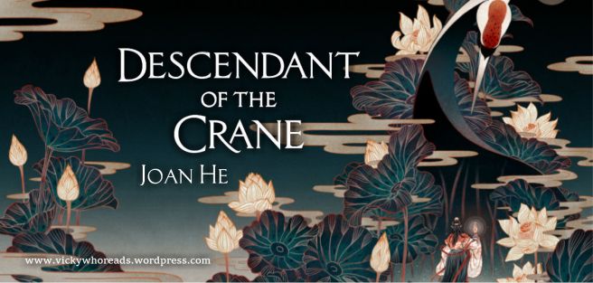
Descendant of the Crane by Joan He
- Found the full jacket WITHOUT text on FeiFei Ruan’s website. SCORE!
- Added the text on with the Wand.

The Poet X by Elizabeth Acevedo
- Full jacket was posted on Twitter at ~some point in time~ and I had it saved on my laptop. Did a bit of painting over the titles, and moved around extracted text. Yay!

Match Me If You Can by Tiana Smith
- I, uh, searched for treehouse and found the stock photo online? And then I used this and other grassy stocks to expand the cover.
- Cut out the text with the Wand, might have painted a few of the hearts myself.

Circle of Shadows by Evelyn Skye
- Grabbed the audiobook cover, selected and edge, and draaaaged it out to make the sides. Done.

You’d Be Mine by Erin Hahn
- Painted over the entire section that had words (probably not worth it, but too late!)
- Added a cornfield stock and fiddled with color etc. to make it match & expand & smooth.

Red, White & Royal Blue by Casey McQuiston
- Cut out Alex & Henry with the Polygon Lasso.
- Repaired a few corners of the text.
- Resized it.

With the Fire on High by Elizabeth Acevedo
- Found most of Emoni’s face on the artist’s Instagram.
- Did some cutting with Polygon Lasso & Wand to reposition fruits & text.

If I’m Being Honest by Austin Siegemund-Broka & Emily Wibberley
- Resized and moved a palm leaf
- Did a lot of fiddling with the background color to get the faint circle
- Cut out the text + did a few repairs to the title.
PAST THIS POINT YOU CAN DOWNLOAD + USE THE FOLLOWING HEADERS FREE FOR PERSONAL USE for blog posts (credit appreciated, but I realize that people just won’t do it so whatever). If you are the author, you are allowed to use my edits free for commercial use.
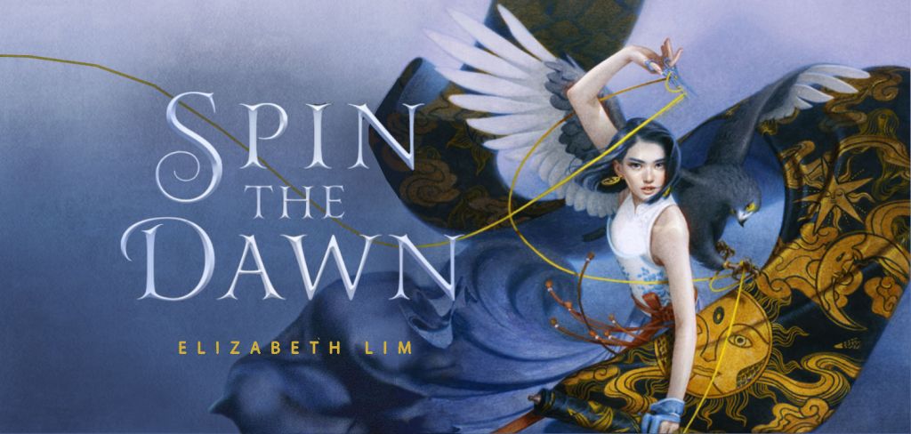
Spin the Dawn by Elizabeth Lim
- THIS IS MY BEST ONE TO DAY
- I painted the left bit of her fabric scroll by hand + upped the noise
- I found a stock of some girl’s billowing skirt and used it to expand her skirt to the left. Did a little painting and noise and color editing to make it match in
- Threw on my favorite paper overlay
- Isolated the text with the Wand
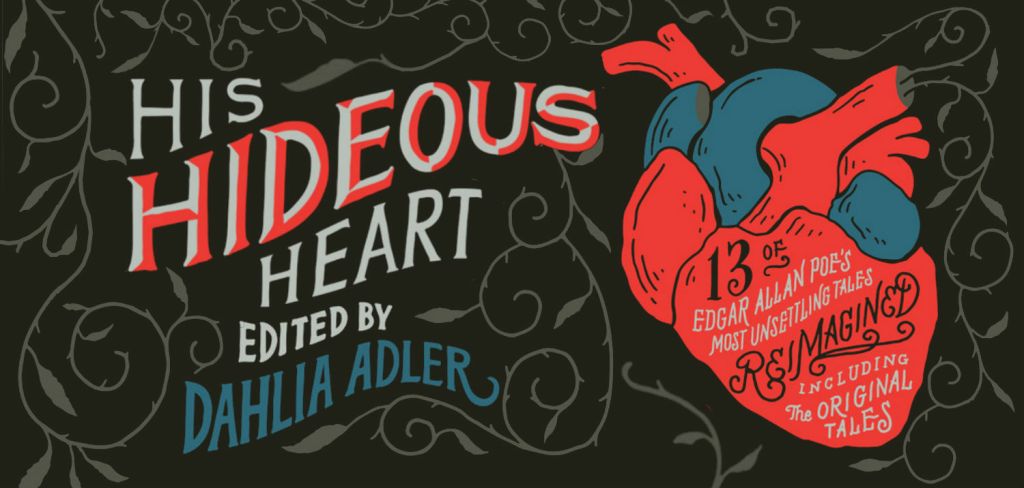
His Hideous Heart by Dahlia Adler
- Just a lot of cutting
- A little bit of drawing a few vines. Fun, though!

Gravemaidens by Kelly Coon
- Some cutting and resizing to make the paper texture appear everywhere. (Too lazy to find a matching stock)

Full Disclosure by Camryn Garrett
- See the video. *dies*
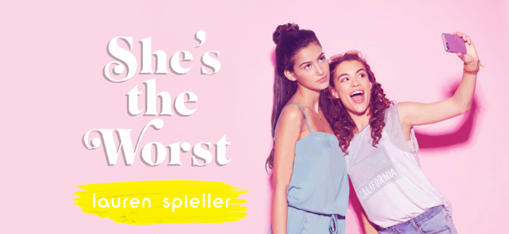
She’s the Worst by Lauren Spieller
- I did a heck of a lot of painting to get the words off of the girls. You can see that the left girl’s armpit looks a bit fabricated, and the right girl’s shirt is a lil wonky. Did a bit of blurring and spot glossing as well as painting.
- Satisfied, though.
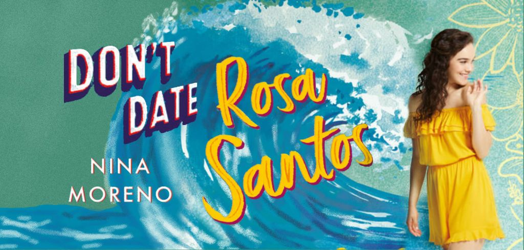
Don’t Date Rosa Santos by Nina Moreno
- I—I painted the wave almost completely from scratch. Anything that had text over it on the cover, I painted myself using a variety of diffused brushes, fuzzy brushes, and Gaussian blurs. Not the most fun, but looks pretty nice in my opinion?
- Grabbed the Rosa from Nina’s Twitter header with a screenshot, so she would have green on her left, not blue (and I could position the wave better.)

When Dimple Met Rishi by Sandhya Menon
- I cut Dimple at the point where her shirt cut off on the cover, so I wouldn’t have to paint much except for a little text off of the cup.
- Covered the words on the cup with copy + paste + fuzzy eraser
- Cut out the title from the cup with Wand & Inverse Selection
- Also grabbed the cup on the left from the full jacket, just for extra cuteness!

The Never Tilting World by Rin Chupeco
- Probably one of the easiest (thank goodness)
- Resized it so part of it was on the left
- Cut out the text with the Wand, Inverse Selection, and a bit of erasing
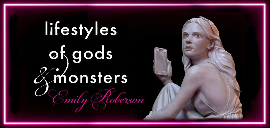
Lifestyles of Gods and Monsters by Emily Roberson
- Flipped the cover on the side, erased everything in the middle, and cut it in half, sticking it on both ends of the canvas
- Grabbed a section of neon from the center and dragged it out, expanding it. Blurred it into the two half pieces to create a full wrap around.
- Resized the girl, erased the bottom, and added on the text with a Wand + Inverse
Impossible Book Covers
Finally. Almost done with this post. Here are some covers that just completely stumped me:
Funny coincidence, but all of these books are books I adored & are on my favorites list–and couldn’t manage to figure out how to edit.

Uhhh yeah no thanks. I was not going to figure out how to recreate that. One of the best books I’ve ever read, though.
Still just ? over how I should approach it.

I was actually just too lazy to color out all of the text on top of Ia—sue me. It probably would have only taken 45 minutes tops, but I was tired that day.

This was . . . an attempt. I’m not gonna say anything else except manipulating Billelis covers can be really really hard sometimes. Grr.

That’s it! I hope this was helpful & I hope you enjoyed!
If you have a book cover you to adapt, let me know what it is and I’ll let you know how I would approach editing it! Alas, I can’t do this for all the books out there, but I hope you’ll eventually be able to do it yourself!
I need a nap after writing this. I’m also using this ginormous post to announce that . . .
I have a Patreon!
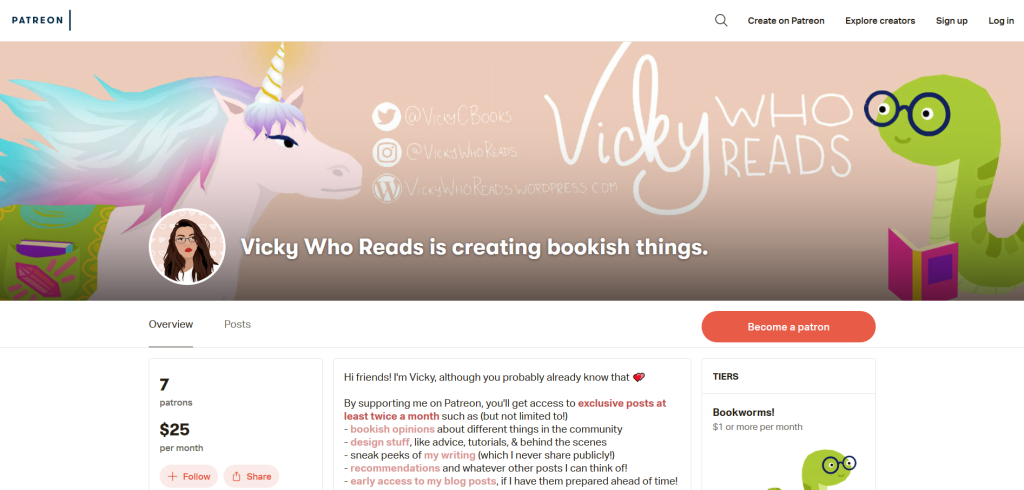
Patreon is a website that lets me give extra content (bonuses, behind the scenes, videos, etc.) to readers who subscribe for $1 or $5 a month! There are a lot of cool bonuses I’m offering, from my own fiction writing to extras and early posts and so much more!
One of the first things I’d use my Patreon money for is buying Photoshop. I would really love Photoshop, y’all. *stares at the non-internet based, non glitchy program that I can make better, higher quality art on quicker* It could make tutorials like this a lot quicker to make . . .
Anyways, I’ll stop babbling! You can check out my Patreon here, and below are some FAQs:
What will happen to Vicky Who Reads & your social channels?
Everything will operate as normal! Patreon will just have bonus content, discounts, and more benefits, but nothing at the cost of my blog. You might be able to read some of my posts early though . . .
But seriously, don’t worry. Patreon won’t be in your face, and it won’t change how things are going right now. It’s extras, not replacement.
Why Patreon?
Because it lets me reward my readers (bonus content! handwritten letter! other cool stuff!) and get paid for my work as a blogger. It lets me be supported while also remaining impartial—instead of sponsored posts, I just have a Patreon. That means you get the same genuine content as always, and I am financially supported (to an exent!).
Why are you asking for money?
For a few reasons:
- I’m heading to college in the fall! I’d love the extra spending money.
- Also, I’d really love Photoshop.
- I want to help normalize bloggers getting paid! Bloggers do a lot of work in the community, and this is a small way I can be supported, so I’ll always appreciate it. I’d love to destigmatize bloggers getting paid for their work.
Are you gonna annoy me about this?
Nope! You’ll see a small thing (this is the long announcement) at the end of one or two posts a month. I’ll tweet out new Patreon posts on Twitter, but ultimately it’ll be very low-key.
Will you hate me if I don’t subscribe?
Definitely not! I appreciate every single one of you and there’s absolutely no pressure to subscribe. I am so grateful for your support and want to keep bringing you fun content!
It’s not a requirement, just a bonus that benefits me and hopefully you too! I really hope I never come off as pushy about this, and I never want you to feel like this is a requirement.
You’re always free to ask me questions about the Patreon and how it works! Thank you again to everyone for helping me come this far ❤

THANK YOU SO MUCH FOR THIS VICKY! i will bookmark this post because it is just so helpful!!!
LikeLiked by 1 person
OF COURSE!!!! I’m glad it’s helpful ahhhhh
LikeLike
Oh my god! Girl, you are amazing at this! I could never do this! I swear I would support you on Patreon but I have no money. lol. As soon as I do, you’ll be my first choice! ❤
LikeLiked by 1 person
lol THANK YOU! and honestly no worries <333 I'm always so grateful for your support ❤
LikeLiked by 1 person
Thank you so much for making this!!
LikeLiked by 1 person
of course!!! I hope it helps!
LikeLike
OMG this is so useful! Thank you for doing this, I will definitely attempt a few covers if I have time!
LikeLiked by 1 person
ahhh yay! i hope they turn out well and am very glad this helped! ❤
LikeLiked by 1 person
Thank you! ♥️ This is an amazing post and you explain all that in the best possible way!
LikeLiked by 1 person
awww omg i’m glad it’s helpful and easy to understand! <3333
LikeLiked by 1 person
SKSKSKS Vicky if you ever want help cutting stuff or retouching I have photoshop just shoot me a DM
LikeLiked by 1 person
LOL I WILL THANK YOU
LikeLike
Bookmarking now!! You are heaven sent. Thank you so much for this. It’s so rare for people to share their secrets and this is something I was in desperate need for 🙂
LikeLiked by 1 person
of course!!! i’m generally not a fan of people keeping their process heavily under lock, so i’m very glad this is helpful and I hope this helps The FFBC! (Elizabeth should also be sending you the two layers to the spin the dawn one for you to use <3)
LikeLike
WOW YOU ARE AMAZING!! I can’t even imagine how much time and work doing this would take. And the fact that you took the time to show us commoners how to do it? I stan 💗💗 Thank you so much for this post—it was so helpful, especially the fact that you included videos of yourself doing it! I love the edits of book covers you do so much and this inside look at your process was amazing😍
LikeLiked by 1 person
awww omg thank you!!! i’m glad it’s helpful awwwww
this is so sweet THANK YOU FOR READING ❤
LikeLiked by 1 person
THANK YOU SO MUCH FOR THIS GUIDE!!! im honestly in awe at how you do this (im so lazy. search for stock pic + slap on some text = done)!! i always love your review headers.
LikeLiked by 1 person
lol i totally get that! I just started doing it and now it feels weird to do differently for my posts! and thank you!!!
LikeLiked by 1 person
You are such a talent Vicky!😍 I have a photoshop but never did I think to do that because this girl is lazy and it’s really a hard work which would take a lot of time. So, I did the easiest route for my blog post headers. But really, you are amazing! I will definitely support you!🤗
LikeLiked by 1 person
awww omg thanks Karlita!!! and your headers are gorgeous so like WOO. awww thank you <3333
LikeLike
I NEEDED THIS. Thank you!! Bookmarking!
LikeLiked by 1 person
OF COURSE! glad it helps!
LikeLike
This is amazing Vicky!!!
LikeLiked by 1 person
THANK YOU LILI
LikeLike
This is so helpful Vicky. Thank you for this. I always love these type of headers, but definitely, there’s a lot of work and practice needed. I am bookmarking this for the time when I want to try this 🙂
LikeLiked by 1 person
oooh yes! practice makes perfect, but I totally get how it can be very very time consuming…
LikeLike
This post is so in-depth and helpful! Thank you for taking the time to put it together.
LikeLiked by 1 person
awww, of course! I hope it’s helpful ❤
LikeLiked by 1 person
You’re so talented Vicky, I admire everything you do so much. ❤ thank you for sharing this! ❤
LikeLiked by 1 person
awww omg thank you marie T_T
LikeLiked by 1 person
THIS IS SO AMAZING and helpful and I am so impressed
LikeLiked by 1 person
AHHH THANK YOU KAY I AM SO GLAD <333
LikeLike
WOW! This blog is amazing and actually comes at good timing. I’m taking a Book Design Software class and learning how to use illustrator, photoshop, and indesign. Watching your tutorials was like reviewing for class. Thanks for the amazing content!
LikeLiked by 1 person
awww, omg! that’s awesome and I’m glad it’s helpful (for you and for preparing for class!) good luck! book design is so so cool!
LikeLiked by 1 person
Vicky! You don’t know how helpful this post is. Thank you so much! I hope you can get Photoshop soon, it will definitely make your life a whole lot easier.
LikeLiked by 1 person
awww, of course and ME TOO! photoshop would be a godsend ahhh
LikeLike
I LOVE THIS VICKY!!! I will probably never have the patience to do this (it seems like it takes so much work!) but I LOVE IT STILL
LikeLiked by 1 person
OMG YES it can definitely be a lot of work BUT YOUR HEADERS ARE ALREADY GORGEOUS SO <3333
LikeLiked by 1 person
This came at the perfect time for me. I was trying to figure out how to resize book cover images without them becoming blurry, and this tutorial just solved it for me. So thank you!
LikeLiked by 1 person
awwww omg i’m so glad!!!! that’s awesome and YAY I’M GLAD IT HELPED <3333
LikeLike
So, I’ve only *just* started editing headers for my blog (hence the recent-ish) change to yellow and I’m glad(?) to see that someone else spends so much time editing things out. I don’t know how long I spent adding extra arms to my header for my A Gathering of Shadows Review because it looked too empty without it. Really helpful post and definitely inspires me to improve (though I think it’s clear that you have artistic talent and I and patience of which I have definitely less of…).
LikeLiked by 1 person
oooooh yes omg! (I love the yellow though–it’s so bright and lovely!) and I totally get that, and I’m glad it was helpful <33333 and LOL I believe in you!!!
LikeLiked by 1 person
Thank you so much for the amazing tutorial! I’m definitely going to be referencing this again and again.
Congrats on opening a Patreon, I’ve never heard of that site before so I’m going to check it out! 🙂
LikeLiked by 1 person
of course!!!! glad it’s helpful.
and awwww thank you! it’s definitely a great resource for creators ❤
LikeLike
Thanks for this tutorial, Vicky! Bookmarking it 🙂
LikeLiked by 1 person
of course!!! hope it helps! ❤
LikeLike
this is utterly amazing, vicky! i did veryyy minor graphic editing way back and you’re making me want to continue it and practice more. hopefully, i’ll be able to learn this kind of editing and have an ounce of your talent /cries/ 💛
LikeLiked by 1 person
OMG NO I BELIEVE IN YOU
two years ago i’d never done any digital art, and look where I am now! so yes I think you can do it I promise <3333
LikeLike
Me this morning: Man I really wish I could figure out a way to make my blog headers look crisp and sharp.
Me this afternoon randomly going through my WordPress feed: OMFG!!! VICKY IS A SAINT.
Thank you so much Vicky. This is truly amazing!
LikeLiked by 1 person
OMG YES I AM SO HAPPY THIS HELPED WOW
it makes it so worth it to hear this–so glad you liked it!!!
LikeLiked by 1 person
WOW, this is amazing! I’ve never thought to do anything like this before. Thank you for sharing what you use and how you do it this will be so helpful!
LikeLiked by 1 person
awww thank you!!! and of course! very happy it will come in handy for people!
LikeLike
Wow! This is such a great resource and really articulates how much you value your blog.
LikeLiked by 1 person
awww, omg that is so sweet of you to say! i’m glad it’s helpful ❤
LikeLike
This is so fantastic Vicky! Thanks so much for this, I think I’ll make a go of it one day when I have time
LikeLiked by 1 person
OF COURSE! Let me know if you ever have any questions about doing it! I believe in you <333
LikeLiked by 1 person